We’ve had a lot of help getting this company and this site to its current state.
Since the beginning, we've spent hours upon hours discussing, considering, refining and tweaking the words, visual identity and marketing strategies of We Sort. Getting this right makes us feel good about what we are and how we work, and it's given our customers and colleagues a firm understanding of where we’re heading.
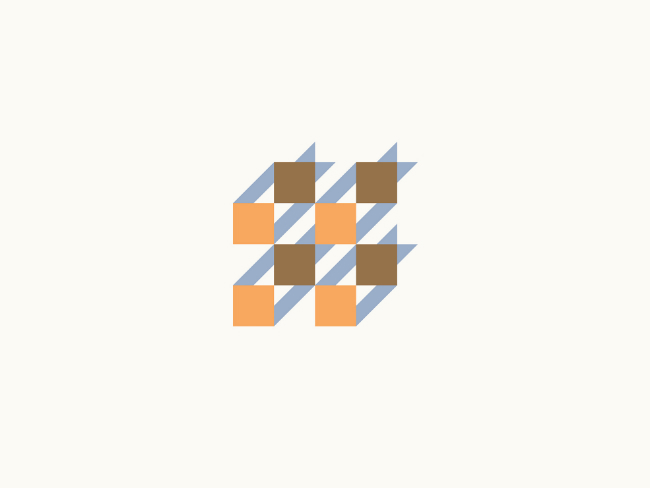
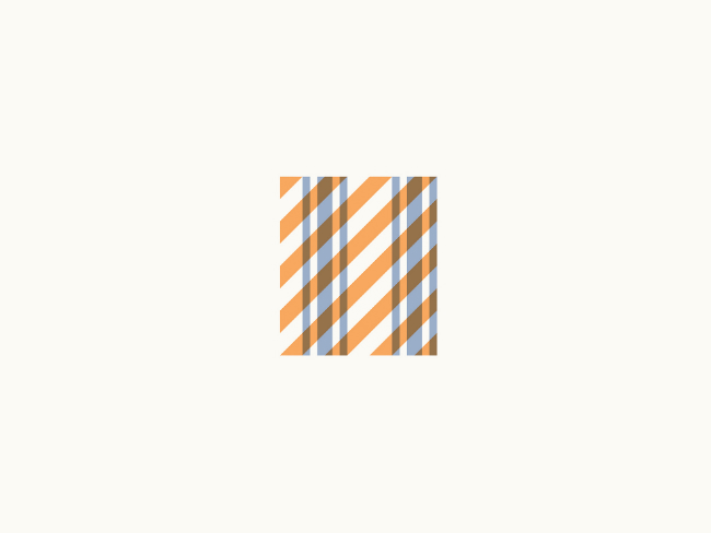
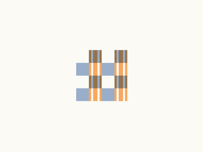
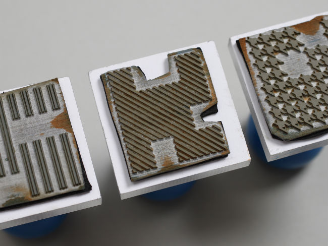
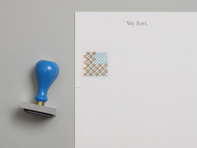
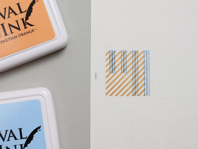
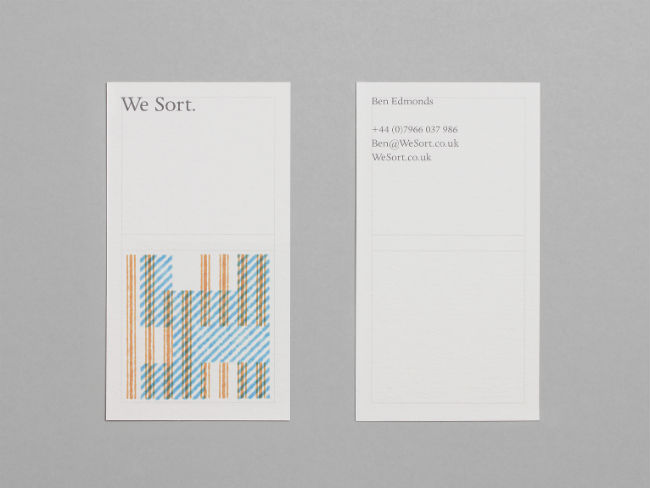
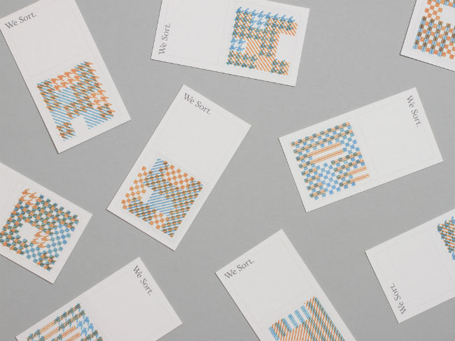
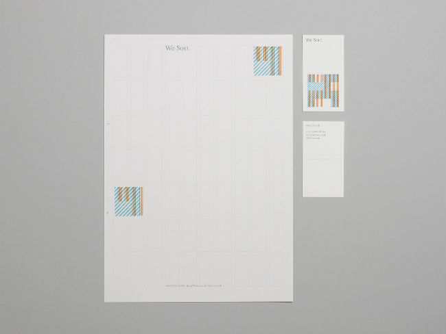
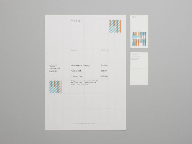
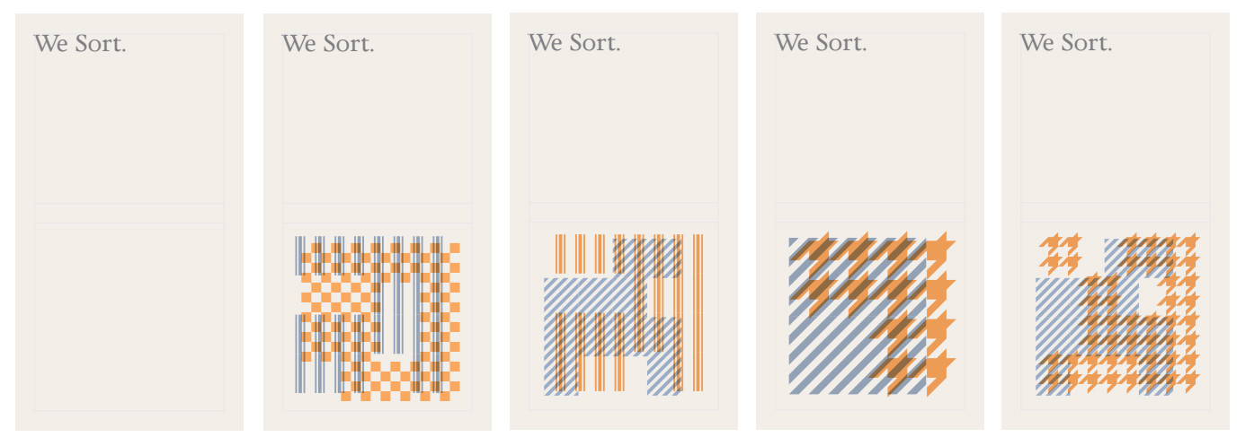
Stylo Design was instrumental in the early days by getting us to our name and creating our logotype. Darren Wall developed an awesome brand identity (see below) that gave We Sort a visual style with remarkable flexibility. Using typography, grids, colour and a system of overlapping patterns, this sensitive interpretation genuinely reflects what we are.
Clients along the way have given us wonderfully positive feedback and encouragement. Though we can't list them all, friends & family continually do for We Sort what We Sort does for its clients - act as an ongoing & engaged sounding board. Thanks guys.
This is the third incarnation of We Sort’s web presence. Our first site was up for about eight months. The second site was supposed to be much sooner, but writing words that described something that was still being figured out was tough. Both of those websites worked reasonably well for the phases of the business they reflected.
This site is different in a few ways. Firstly, it spreads across a number of pages. Secondly, it consistently uses our brand identity across all of our web spaces (main site, blog, Twitter, etc). Thirdly, the site has been built using the ideas of ‘responsive web design’ - this means that one set of code of html & css is used regardless of the browser or device. In other words it doesn’t matter how you view the site - desktop, mobile, tv - it will appear as intended. No pinching or horizontal scrolling. The code looks at your browser window’s width and adapts accordingly.
To construct this site responsively we used Ethan Marcotte’s very good book, Responsive Web Design. We were alerted to this approach by graphic designer Jessica Hische and found her own site’s source code very informative. We used Eric Meyer’s css reset. We used ShiftEdit.net to write all the code and did all this on a Chromebook. And finally, without Google’s search and the prolific sharing of many, many web developers this site would still be in lots of teeny tiny pieces.
Thanks to all - it is much appreciated.
Design & photgraphy by Darren Wall